
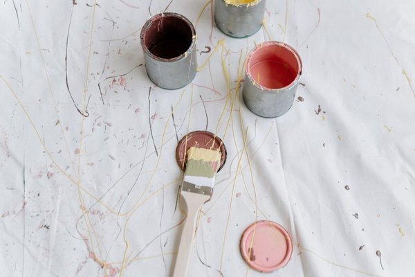
Walk into any paint store this year and you’ll notice something different. The stark, cool whites that dominated the last decade are quietly stepping aside. In their place, designers are reaching for warmer, richer, more layered colors that feel less like a trend and more like a return to comfort. If you’re planning a refresh, the best paint colors for 2026 interiors lean into warmth, texture, and a sense of grounded calm rather than the clinical brightness we’ve grown used to.
This shift isn’t just aesthetic preference. After years of minimalist, all-white interiors, homeowners are craving spaces that feel lived-in and personal. The result is a new wave of 2026 paint trends built around tone-on-tone layering, earthy neutrals, and colors that shift character depending on the light hitting them.
Why 2026 Is All About Warmth
Designers point to a simple reason for this pivot: stark white can feel sterile, especially in homes where people are spending more time. Warm neutral paint tones—think soft beiges, warm taupes, and muted terracottas—create a sense of coziness without sacrificing the airy, updated feel homeowners still want. These shades also tend to photograph beautifully in natural light, which matters more than ever given how many buyers and renters browse homes online first.
The Move Away From Stark White
Pure white walls aren’t disappearing entirely, but they’re being reconsidered. Designers are swapping icy, blue-based whites for warmer versions with hints of cream or greige underneath. The effect is subtle but significant—rooms feel softer, less clinical, and more welcoming the moment you walk in.
The Top Designer Paint Colors for 2026
Across designer mood boards and paint brand forecasts alike, a handful of colors keep resurfacing. These aren’t fleeting fads; they’re shades chosen because they work across multiple design styles, from modern farmhouse to transitional and even mid-century spaces.
Warm Neutrals and Greiges
Soft, warm neutrals remain the backbone of most 2026 color palettes. Shades that blend beige with a whisper of gray create a backdrop that’s flexible enough to pair with both bold accent walls and natural wood tones. These colors work particularly well in living rooms and kitchens, where they need to complement everything from cabinetry to furniture without competing for attention.
Earthy Terracottas and Clay Tones
Clay-inspired hues are having a real moment. Warm terracotta, muted rust, and soft clay tones bring an organic, grounded feel to interiors, especially in dining rooms and entryways. These colors pair beautifully with natural materials like rattan, linen, and unfinished wood, reinforcing the broader move toward earthy, nature-inspired interiors.
Deep, Layered Greens
Green continues its steady rise, but 2026 favors deeper, more muted versions—think sage, moss, and forest tones—over the brighter greens seen in previous years. These shades work especially well in bedrooms and home offices, where a slightly moodier palette can create a calming, focused atmosphere.
Soft Blush and Dusty Pinks
Pink hasn’t disappeared; it’s just matured. Dusty, muted pink tones are showing up in bedrooms and powder rooms, offering warmth without feeling overly sweet. Paired with warm neutral paint on trim and ceilings, these shades feel sophisticated rather than saccharine.
How Designers Are Layering Color in 2026
One of the defining features of this year’s palettes isn’t a single color at all—it’s how colors are being combined. Rather than painting an entire room one flat shade, designers are layering two or three tonal variations within the same color family. A room might feature warm neutral paint on the main walls, a slightly deeper shade on trim, and an even richer tone on a single accent wall or built-in shelving unit.
This tonal layering creates depth without introducing visual clutter. It also makes rooms feel more intentional, as though the color choices were considered rather than simply picked off a swatch card at random.
Pairing Warm Tones With Natural Materials
Another consistent theme among designer paint colors this year is how well they interact with natural materials. Warm neutrals and earthy tones are frequently paired with wood, stone, woven textiles, and matte metal finishes. The goal is a cohesive, grounded look where the paint color supports the room’s materials rather than standing apart from them.
Choosing the Right Shade for Your Space
With so many appealing options, narrowing down a single color can feel overwhelming. A few practical considerations can help simplify the decision.
Consider Natural Light
Rooms with abundant natural light can handle deeper, more saturated tones without feeling closed in. Darker or north-facing rooms, on the other hand, often benefit from warmer, lighter neutrals that help bounce available light around the space.
Think About Room Function
Calming tones like sage green or dusty blush suit bedrooms and bathrooms, where relaxation matters most. Warmer, more energetic shades like terracotta work well in social spaces such as dining rooms and entryways, where you want the color to make a first impression.
Test Before You Commit
Because so many of 2026’s most popular shades shift depending on lighting conditions, it’s worth testing a sample directly on your walls before committing to a full room. Colors can look noticeably different in morning light versus evening light, and even the finish—matte, eggshell, or satin—can change how a shade reads in person.
Frequently Asked Questions
What is the most popular paint color for 2026?
Warm, greige-toned neutrals are leading the way, with designers favoring them over the cooler, stark whites that were popular in previous years.
Are bold colors still in style for 2026?
Yes, but with a twist. Rather than bright, saturated hues, the boldness in 2026 comes from deeper, more muted tones like forest green and clay-based terracotta, used thoughtfully as accents or layered shades.
Is white paint out of style in 2026?
Not entirely, but pure, cool-toned white is being replaced by warmer whites and creams that feel softer and more inviting.
What paint finish works best with 2026’s trending colors?
Matte and eggshell finishes are especially popular this year, as they complement the soft, layered look designers are going for, particularly with warm neutral paint tones.
Final Thoughts
The best paint colors for 2026 interiors share a common thread: warmth. Whether it’s a soft greige, a muted clay, or a deep, layered green, this year’s palette favors colors that feel grounded, comforting, and a little more personal than the stark minimalism of recent years. If you’re planning your next paint project, leaning into these warmer, richer tones is a safe bet—not just because they’re trending, but because they genuinely make spaces feel better to live in.