
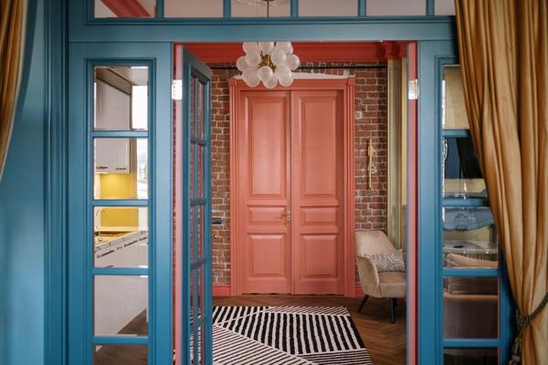
For years, the safest decorating advice was to keep walls white, layer in beige, and let accessories supply the personality. In 2026, that formula is starting to feel overly cautious. Homeowners are not abandoning neutrals, but they are using richer paint colors to give rooms a clearer point of view. The bold accent wall is returning as a practical middle ground: expressive enough to transform a space, yet contained enough to live with comfortably.
This comeback is more considered than the feature walls of the early 2000s. Instead of choosing a bright color simply to make one wall different, designers are linking the painted surface to architecture, light, furniture, and mood. The result feels intentional rather than random.
Why Bold Accent Walls Feel Right Again
The shift is visible across 2026 paint forecasts. Behr selected smoky jade Hidden Gem, Benjamin Moore chose the espresso-charcoal Silhouette, Glidden highlighted Warm Mahogany, and Dulux introduced expressive indigo blues. These choices vary, but they share depth, warmth, and emotional presence.
The appetite for bold wall colors is not about shock value. It is a response to interiors that have become visually flat. When walls, upholstery, flooring, and cabinetry all sit within a narrow neutral range, a room may lack a focal point. A saturated wall restores contrast and gives the eye somewhere to land.
The Colors Leading the 2026 Comeback
Smoky Jade and Botanical Green
Green remains connected to nature-inspired interiors, but the 2026 direction is deeper than recent pale sages. Smoky jade, forest green, and blue-leaning botanical shades work well with light oak, cream upholstery, brass, and natural stone.
Use these colors on a fireplace wall, behind a dining-room sideboard, or on the bed wall. In north-facing spaces, test carefully because a blue-heavy green may turn colder than expected.
Espresso and Charcoal Brown
One of the strongest bold accent wall color trends 2026 is the rise of dark brown as a design color. Espresso, roasted coffee, and charcoal-brown shades create drama with less severity than true black. They pair naturally with walnut, leather, linen, aged metals, and warm lighting.
A dark brown statement wall paint can sharpen artwork and pale furniture. It also suits a home office or reading corner because it creates a cocooning effect. Keep adjacent walls lighter in a small room, and repeat the dark tone in a few details.
Warm Mahogany and Earthy Red
Red is returning in a more livable form. Rather than primary red, 2026 favors shades softened by brown, clay, or wine undertones. Warm mahogany, oxblood, brick, and muted burgundy bring intimacy to dining rooms, libraries, entryways, and bedrooms. They work especially well with antique wood, woven textures, creamy paint, and ochre accents.
Strong sun can make red feel louder, while gentle daylight or layered evening lighting reveals its depth. Paint a large sample and view it morning, afternoon, and after dark.
Saturated Indigo and Inky Blue
Inky indigo creates a striking focal point in coastal, contemporary, and traditional rooms. Pair it with crisp white for contrast, warm tan for balance, or rust and coral for a more adventurous palette.
Indigo works well behind a television because it visually softens the black screen. It can also define a home-office zone in an open-plan room. A natural internal reference here is 2026 color palette trends.
Where an Accent Wall Works Best
The best wall is not automatically the first one visible from the doorway. Look for a surface that already has a reason to attract attention. A fireplace, built-in shelving, a headboard, a dining banquette, or large artwork gives the color a visual anchor.
In open-plan homes, color can create a boundary without adding a wall. Imagine a combined living and dining room with warm white walls. Painting the dining-zone wall smoky jade, then repeating that green in a vase and cushion, creates a distinct destination while keeping the floor plan connected.
How to Make a Bold Wall Look Deliberate
Start with the room’s fixed elements. Flooring, countertops, fireplaces, and large furniture are harder to change than paint, so the accent color should relate to their undertones. Warm oak usually welcomes earthy red, olive, or espresso. Cool gray stone may suit indigo, blue-green, or plum.
Next, decide how much contrast you want. A dramatic scheme may place a dark wall beside warm white. A softer approach might combine burgundy with dusty rose or smoky jade with muted olive.
Do not judge a color from a small card. Paint two coats on a movable sample board at least 60 centimetres square. Check it beside the floor, curtains, and furniture at different times of day. This prevents choosing a color that looks perfect under shop lighting but turns dull or harsh at home. How to choose paint colors for natural light is another useful internal-link topic.
Finally, let the bold surface lead. If every element is equally loud, the focal point disappears. Support the wall with quieter textures, repeated accents, and visual breathing room.
Common Mistakes to Avoid
A random wall with no architectural purpose can look unfinished. So can a vivid color that appears nowhere else in the room. Repeating the shade subtly in art, textiles, ceramics, or books creates cohesion without making everything match.
Another mistake is assuming dark paint always makes a room feel smaller. A dark accent wall can add dimension when surrounding surfaces remain lighter and the room has layered lighting.
Trend reports are useful inspiration, but the right color still depends on the home. A fashionable mahogany that fights with cool flooring is not better than an indigo that suits the room beautifully. Use trends as direction, not a rulebook.
Frequently Asked Questions
Are accent walls still in style in 2026?
Yes, but the look is more intentional. The strongest examples highlight architecture, define a functional zone, or support an existing focal point rather than adding an unrelated splash of color.
What bold accent wall colors are popular in 2026?
Smoky greens, espresso browns, warm mahogany reds, and saturated indigo blues are prominent across 2026 color forecasting. Each offers depth while remaining easier to coordinate than a bright primary hue.
Should an accent wall be darker than the other walls?
Usually, but not always. A deeper shade creates clear contrast, while a saturated mid-tone can work better in a small or dim room. The difference should be visible enough to look purposeful.
Can a small room handle a bold accent wall?
Absolutely. Choose a wall with a clear focal role, keep surrounding colors supportive, and test the shade under the room’s actual lighting. Darker colors can add depth rather than simply making the room feel enclosed.
A More Confident Use of Color
The return of the bold accent wall reflects a wider change in decorating: homes are becoming more personal, layered, and emotionally expressive. The best rooms will use saturated paint to frame a view, define a zone, strengthen architecture, or create a mood that neutral walls alone could not deliver.
Choose a color that connects with the room, test it properly, and give the wall a clear job. Done well, a single painted surface can move a space beyond safe and forgettable without sacrificing balance or long-term livability, with confidence and restraint.