
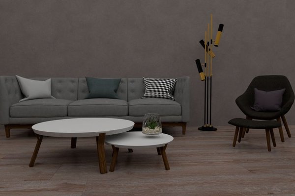
Choosing colors for a living room can feel surprisingly complicated. A paint shade looks beautiful online, but beside your flooring and sofa it suddenly feels wrong. The most useful living room color scheme ideas start before you buy cushions or repaint walls: they establish a relationship between the room’s biggest surfaces, its light, and the atmosphere you want.
Think of your palette as a small team. One color creates the background, another adds dimension, and a restrained accent makes the space personal. They should work together without every item matching.
Start With the Elements You Already Own
Look first at the difficult-to-change finishes: flooring, fireplace stone, built-in cabinetry, and major upholstery. Golden oak flooring contributes warmth, for example, while a charcoal sofa may introduce a cooler note. Select paint and accent colors in conversation with those finishes rather than treating the walls as a blank canvas.
Gather real samples of your likely wall color, rug, upholstery, and wood tones. Compare them beside each other in the living room. A patterned rug containing cream, olive, and rust can bridge pieces that initially seem unrelated.
Notice Undertones, Not Just Color Names
Two shades labeled beige can behave very differently: one may lean pink, the other yellow or green. White paints vary too. Place samples next to your existing finishes and compare several options side by side. Repeating compatible undertones usually creates more cohesive room colors than buying products simply because they share a color name.
Give Your Colors Different Jobs
Begin with a dominant background, a supporting color, and a smaller accent. The familiar 60-30-10 approach can help you visualize that balance, but it is a flexible guide, not a rule. Light walls might dominate, a sofa could provide the supporting tone, and artwork or textiles could carry the accent. Variations in shade add depth.
Living Room Color Combinations Worth Trying
These living room palette ideas offer distinct moods. Adapt their brightness and warmth to your actual room rather than copying every detail.
Warm Ivory, Olive, and Oak
Ivory walls soften the background, olive cushions or an occasional chair add gentle color, and natural oak lends warmth. Cream upholstery and a few deeper green details keep the combination restful without making it bland. This works especially well with warm timber floors.
Misty Blue, Sand, and Navy
Muted blue brings calm, sandy beige prevents the space feeling chilly, and navy provides definition in frames, rugs, or small furniture. Off-white fabrics can connect the lighter elements. If the room is naturally cool, choose a blue with a soft, slightly grayed quality.
Taupe, Terracotta, and Cream
Use taupe as a versatile wall or sofa color, then introduce terracotta through pottery, cushions, or artwork. Cream softens the earthy contrast. Avoid making every accessory orange; repeated red-brown touches are more effective when there is breathing space between them.
Soft Gray, Dusty Rose, and Walnut
Gentle gray, muted rose, and dark walnut create a quieter contemporary palette. The wood adds richness, while a little charcoal introduces contrast. Check the gray next to the walnut: a strongly blue undertone can make their relationship feel sharper than expected.
Forest Green, Oatmeal, and Brass
Deep green makes a confident focal color for a sofa, cabinetry, or one wall. Oatmeal upholstery and a pale rug prevent the room from feeling heavy. Small aged-brass details bring warmth without competing with the green.
Test the Palette in Real Daylight and Lamplight
Color changes with illumination. A neutral that looks warm in afternoon sun may appear flatter or cooler on an overcast day. Lamps can also shift the apparent warmth of walls and fabrics. Window direction helps, but nearby buildings, trees, and the bulbs you use matter as well.
Try large painted sample boards on more than one wall, checking them in the morning, afternoon, and evening. Switch on the lamps you normally use. A quick glance at a tiny chip in a store cannot show how paint will behave in your particular space. If you relax there mainly at night, prioritize that view.
Use Contrast and Repetition Instead of Exact Matching
A living room filled with one beige can feel flat. Create light-to-dark variation: pale walls, a medium-toned sofa, and darker details in a rug or picture frame, for example. Texture adds another layer. Wool, linen, wood, and matte paint can look interesting even when their colors are closely related.
Repeat an accent in two or three visible places. Blue in a rug might appear again in artwork across the room, making both pieces feel intentional. For further planning, guides to warm versus cool neutrals, living room lighting ideas, and choosing an area rug offer useful next steps before shopping.
A Practical Example: Connecting an Oak Floor and Gray Sofa
Imagine golden oak flooring, a medium-gray sofa, and windows that get strong afternoon sun. A stark cool white on the walls could emphasize the floor’s yellow tones while leaving the sofa looking disconnected. Instead, compare several soft off-whites beside both existing finishes, and introduce a muted olive fabric and a rug containing gray and cream.
Choose the off-white that looks balanced under daylight and lamps. Repeat olive in a cushion and a small artwork detail, then let the pale rug create separation from the sofa. Photograph the grouping for reference, but decide in person because screens can distort color. This sequence settles the major relationships before you spend on decorations.
Mistakes That Make a Palette Feel Unplanned
Avoid choosing paint before considering permanent finishes, copying a photograph without checking your own light, or adding several unrelated bright accents. Also remember that contrast is not a mistake. Warm wood and cool blue can look beautiful together when a shared neutral connects them. The goal is considered variety, not uniformity.
Frequently Asked Questions
How many colors should I use in a living room?
Three main color roles are an easy starting point: background, supporting tone, and accent. Lighter and darker variations of those colors can provide additional depth without making the room busy.
Should living room walls be lighter than the sofa?
Not necessarily. Pale walls and dark upholstery provide straightforward contrast, but darker walls with light furniture can feel equally balanced. Consider natural light, flooring, and how the room is used.
Can warm and cool colors belong in the same palette?
Absolutely. Muted blue and warm oak, for instance, can complement each other when connected by cream or another shared neutral. Test actual samples together rather than following a strict warm-only rule.
How do I know my chosen colors will work?
Compare substantial paint and fabric samples beside existing surfaces at several times of day. Check the arrangement under your usual lighting and buy expensive pieces only after the combination feels right.
A Living Room That Feels Pulled Together
The strongest living room color scheme ideas respect what is already there. Start with fixed finishes, allow for changing light, add meaningful contrast, and repeat accents with restraint. Once the palette makes sense, choosing curtains, cushions, and artwork becomes easier—and the room feels comfortable rather than overly coordinated.