
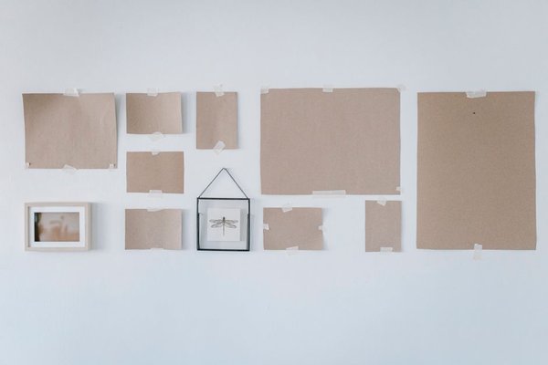
A gallery wall looks effortless when the spacing, outer shape, and centre line are planned before the first nail goes in. Choose an overall footprint, decide how much air sits between frames, then test the arrangement with paper templates. A practical starting point for gallery wall spacing is 5-8 cm between frames, tightening for small pieces and widening for oversized art.
Trace every frame onto kraft paper or old wrapping paper, mark the exact hook position on each template, and tape the shapes to the wall. You can then refine the picture wall arrangement without creating a row of trial holes.
Plan the wall before choosing a layout
Measure the usable wall area and set an imaginary boundary for the finished display. Above a sofa, console, or bed, a gallery wall often feels connected to the furniture when its total width is roughly two-thirds to three-quarters of the piece below it. Choose one spacing value and repeat it throughout. A uniform 5-8 cm gap suits many mixed layouts, while 3-5 cm can make small frames read as one composition.
12 gallery wall layouts you can copy
1. The classic symmetrical grid
Use matching frame sizes in equal rows and columns. This is one of the easiest frame wall ideas to measure and works well in dining rooms, offices, and formal living spaces. Keep both horizontal and vertical gaps identical. Six pieces can form two rows of three; nine can create a three-by-three block.
2. The wide two-row grid
For a long sofa or sideboard, stretch the grid horizontally instead of building upward. Two rows of three, four, or five frames create a panoramic line without making the wall feel too tall. Align the outer edges precisely and keep the gap between rows equal to the side-to-side spacing.
3. The three-piece triptych line
Three equal frames in one horizontal row suit narrow walls, headboards, and compact consoles. Keep the spacing even and let the shared line do the organising. This arrangement is especially effective when the images share a colour palette or form a visual sequence.
4. The single long gallery line
Place several frames along one shared horizontal centre line, even if their heights differ. Start with the largest piece near the middle and balance smaller frames on either side. The result feels collected but still structured.
5. The salon-style cluster
A salon layout mixes sizes and orientations while maintaining fairly tight spacing. Begin with one anchor piece, then build outward in small zones rather than randomly filling gaps. Keep the overall silhouette compact. Paper templates help because small spacing changes can alter the balance.
6. The large-anchor arrangement
Choose one dominant artwork and position smaller pieces around it. The anchor can sit centrally or slightly off-centre for a relaxed look. Keep the gaps between neighbouring frames consistent even when their edges do not align. This makes mismatched art feel intentional.
7. The staircase diagonal
Follow the angle of the stairs with a rising line of frames. Establish an imaginary line that follows the stair pitch and align the visual centres to it. Keep the distance between frames steady so the display reads as a continuous path upward.
8. The corner-wrap gallery
Use two adjoining walls as one composition and let the gallery turn the corner. Keep the spacing near the corner similar to the gaps elsewhere. Place the strongest piece on the larger wall, then continue with smaller frames around the return wall.
9. The picture-ledge arrangement
A picture ledge gives you gallery-wall impact without fixing every frame to one nail position. Layer a few frames with small overlaps, while keeping important artwork visible. It is a useful choice if you regularly rotate prints, photos, or seasonal pieces.
10. The vertical column
Stack three to five frames down a narrow strip beside a doorway, between windows, or at the end of a hallway. Keep the centres aligned vertically and use equal gaps. A narrow column makes use of space that is too slim for a conventional gallery.
11. The TV surround
Build the gallery around a wall-mounted television so the screen becomes part of the overall rectangle. Leave a little more breathing room immediately around the TV than between smaller frames. Medium or dark frames can visually integrate the screen.
12. The invisible outer rectangle
Mix frame sizes but arrange them so the outside edges form a clean imaginary rectangle. Set the top, bottom, left, and right limits with paper templates, then fill the interior. The neat outer boundary keeps a mixed-size display from looking chaotic.
A practical spacing test before hanging
Imagine a 210 cm sofa with a blank wall above it. You might plan a gallery footprint around 140-155 cm wide, centre it over the sofa, and begin with 6 cm gaps between paper templates. Tape the largest template first, add neighbouring pieces, then stand back from the doorway. If the grouping feels scattered, reduce the gaps before shifting the entire display.
Check the arrangement from the main seated position too. A layout can look balanced while you are standing with a tape measure yet feel too high from the sofa. Paper templates reveal that problem before mounting.
Details that make the finished wall look deliberate
Repeat at least one visual element across the display: frame finish, mat colour, artwork palette, or subject style. Mixed frames can still feel coherent when one detail connects them. Related topics worth linking internally include choosing wall art for a living room, renter-friendly wall decor ideas, and how to choose the right artwork size for a wall.
Use a level for every frame rather than assuming the first straight frame will keep the rest aligned. Small adhesive bumpers on the lower corners can also help stop frames from shifting after installation.
Frequently asked questions
How far apart should gallery wall frames be?
A useful starting range is about 5-8 cm between frames. Smaller pieces can sit closer, while larger frames may need more breathing room. Consistency matters more than finding one universal measurement.
Should a gallery wall be centred on the wall or the furniture?
When the display hangs above a sofa, bed, console, or sideboard, centring it on the furniture usually creates a stronger relationship, even if the furniture itself is not centred on the wall.
How do I arrange different-sized frames?
Start with the largest frame as an anchor, then add medium and small pieces around it while maintaining consistent gaps. A salon cluster or invisible outer rectangle is often easier to balance than forcing mixed sizes into a strict grid.
What is the easiest gallery wall layout for beginners?
A symmetrical grid is the simplest because every gap and alignment can be measured. If your frames are different sizes, the large-anchor arrangement is an easy alternative because it gives the composition an obvious focal point.
Make the layout work before making holes
The best gallery wall layout ideas are measurable and easy to test. Pick a clear outer shape, use consistent spacing, and arrange full-size paper templates before installing hardware. Once the proportions feel balanced from both standing and seated viewpoints, hanging the real frames becomes a straightforward final step rather than an exercise in patching misplaced holes.